CS333
Mobile Development
Ilya Loshkarev loshkarev.i@gmail.com
Overview
UIKit
View Architecture
Every view has underlying Core Animation layer
- UIView – defines a rectangular region on the screen and handles the drawing and touch events
- CALayer – manages the backing store for the view and handles view-related animations
View Properties
							// Defines position of the view in it's parent
							var frame: CGRect
							// Defines bounding rectangle for view's content
							var bounds: CGRect
							// Array of all subviews contained in the view
							var subview: [UIView]
							// Access to underlying Core Animation
							var layer: CALayer
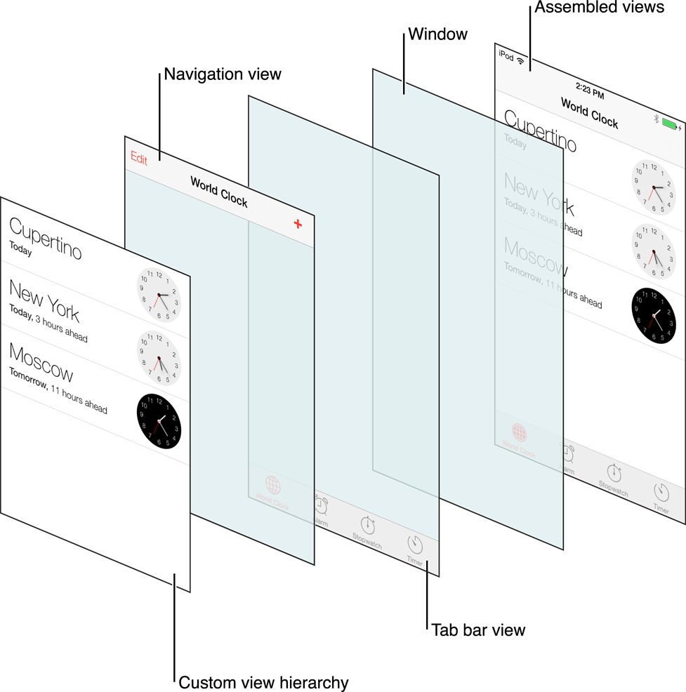
Views Stack
UIView Subclasses
| UILabel | displays static text |
|---|---|
| UIPickerView | lets the user choose between certain options |
| UIImageView | displays an image or an animated sequence of images |
| UIWebView | can display HTML content |
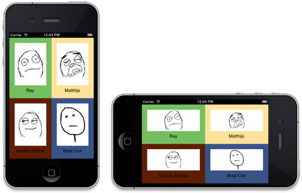
UIScrollView
Allows to display content bigger than view's boundaries
| UITableView | presents data in a scrollable list of multiple rows |
|---|---|
| UICollectionView | displays an ordered collection of data items |
| UITextView | accepts and displays multiple lines of text |
UIControl
Conveys a particular action or intention to the app
through user interaction
| UIButton | lets a user initiate behavior with a tap |
|---|---|
| UITextField | allows the user to input a single line of text |
| UISwitch | lets the user turn an option on and off |
| UISlider | enables users to interactively modify some adjustable value |
| UIDatePicker | is used for selecting a specific date, time, or both |
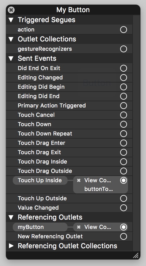
Outlet
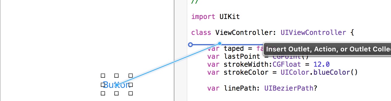
Connects storyboard item to the code
@IBOutlet weak var myButton: UIButton!
Action
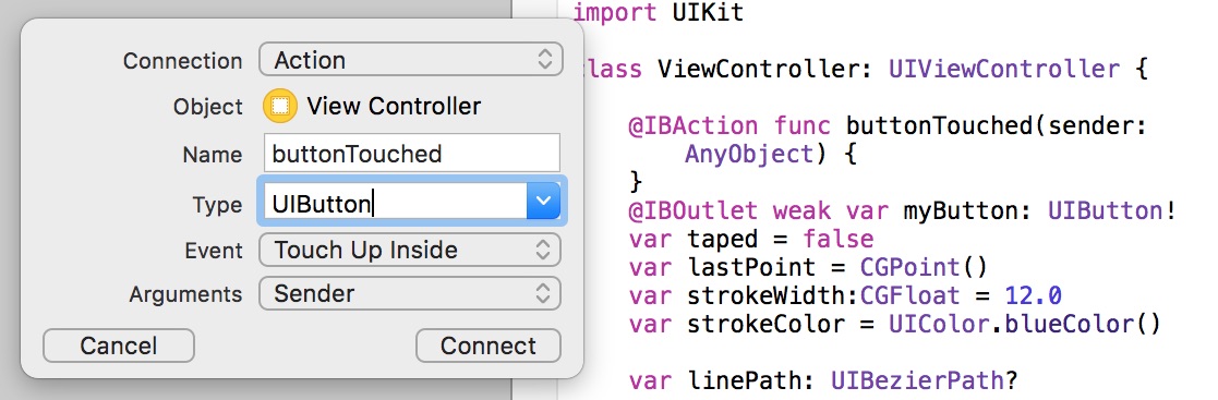
Connects event handler to a control
@IBAction func buttonTouched(sender: UIButton) { }
Connections
connected to the UI element
Element must be removed from connections
when deleted
Auto Layout
Purpose
Auto Layout provides a set of constraints
to describe position and size of a view
in relation to its surrondings
Attributes
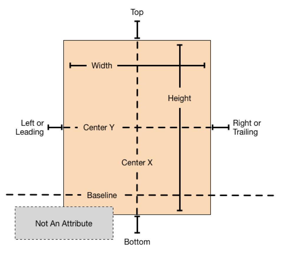
Every view has 9 Layout Attributes
Anatomy of Constraint
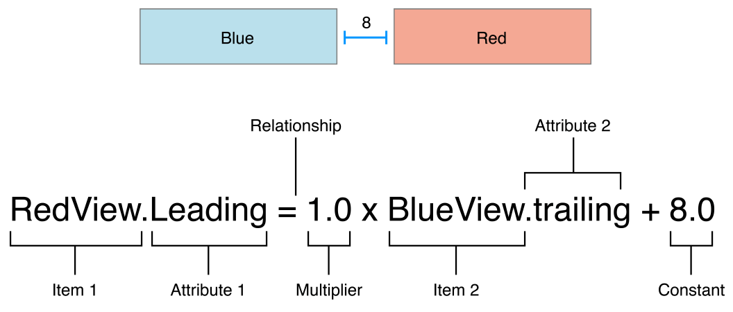
Every constraint describes relationship
between two attributes
Types of Constraints
- Alignment Constraint describes how views are positioned in relation to each other and to their container
- Pinning Constaraint describes view's intrinsic attributes and margins
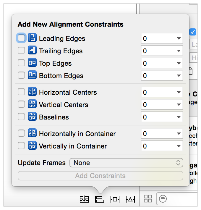
Alignment Constraints
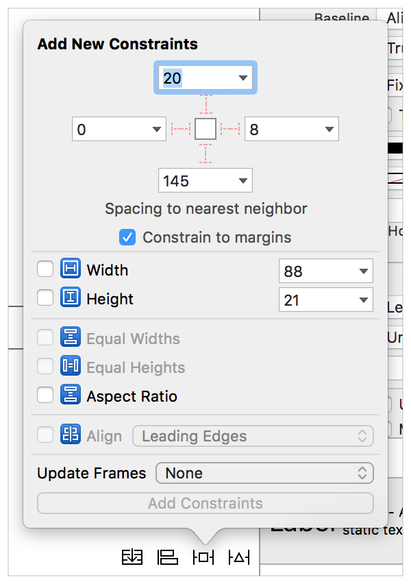
Pinning Constraints
Debugging Constraints
- Warnings can be resolved automatically by either fixing view, or modifing constraints
-
Errors could only be resolwed by a programmer:
- Unsatisfiable Layouts: your layout has no valid solution
- Ambiguous Layouts: your layout has two or more possible solutions
- Logical Errors: there is a bug in your layout logic
Stack View
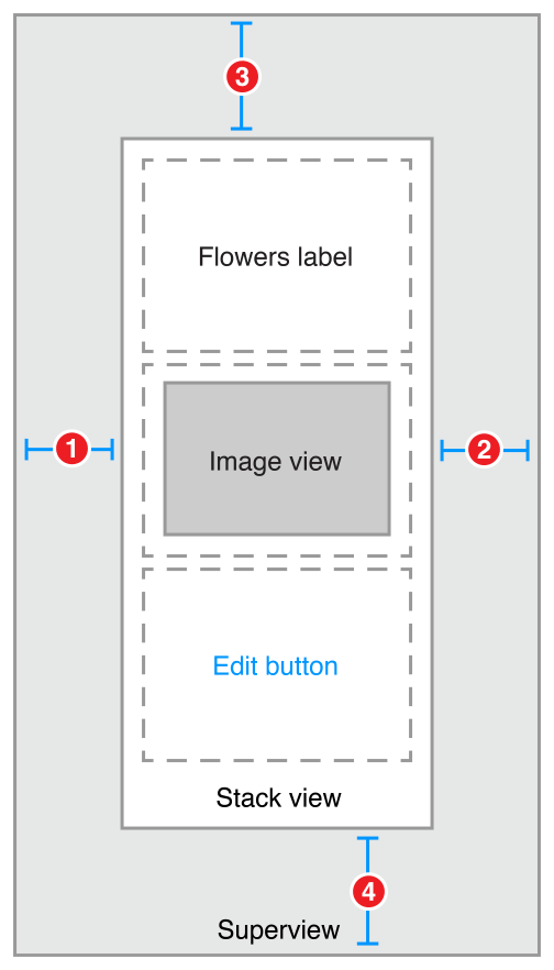
Allows automatic alignment of contained views
for simplified layout
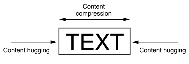
Intrinsic Content Size
-
Content hugging pulls the view inward
so that it fits snugly around the content -
Compression resistance pushes the view outward
so that it does not clip the content
Constraints at Runtime
							// Creaye new constraint
							// myView.Leading = view.LeadingMargin * 1.0 + 0.0
							let constraint = NSLayoutConstraint(
								item: myView, attribute: .Leading,
								relatedBy: .Equal,
								toItem: view, attribute: .LeadingMargin,
								multiplier: 1.0, constant: 0.0)
							// Activate new constraint
							constraint.active = true
							// Recalculate view's dimentions
							myView.layoutIfNeeded()
							// Remove new constraint
							myView.removeConstraint(constraint)
Default Controllers
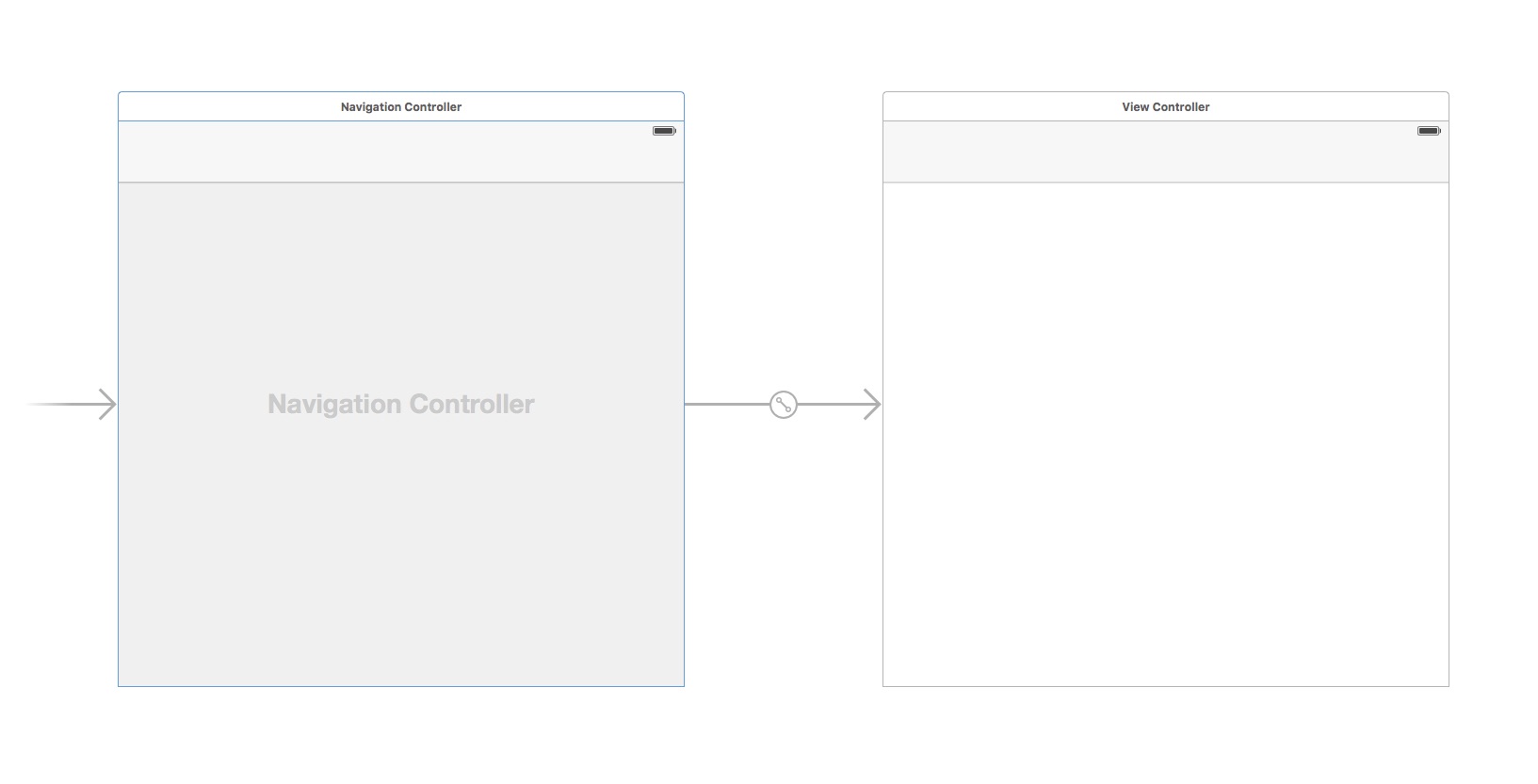
Navigation Controller
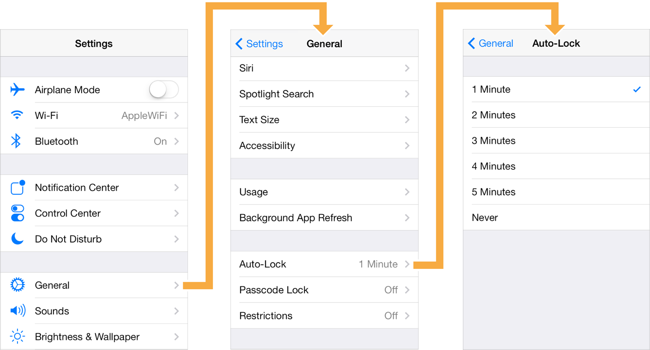 Allows users to navigate to the previous view
Navigation Bar

A navigation bar can display a left button, title, prompt string and right button(s)
Navigation in Storyboard
Editor → Embed In → Navigation Controller
Tab Bar Controller

Provides easy access to different views in an app
Each view can be a start of separate view stack
Table View Controller
Can be divided into sections
Each section contains
any number of cells
Able to present static or
dynamic content
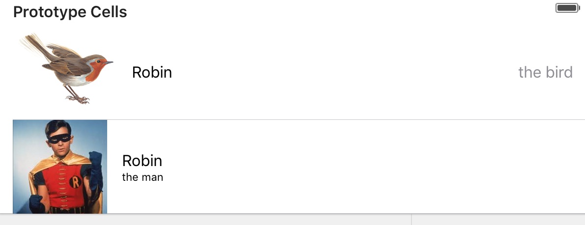
Table View Cell
- In dynamic Table View
Each prototype cell describes appearence of
multiple cells in the table. Each prototype has a Reuse Identifier - In static Table View
Each cell added in Interface Builder describes its own content
Prototype Cells
Each prototype cell describes appearence of
multiple cells in the table

Each prototype cell has a Reuse Identifier
Default Cell Style
							// Returns the label used for the main textual content of the table cell
							var textLabel: UILabel?
							// Returns the secondary label of the table cell if one exists
							var detailTextLabel: UILabel?
							// Returns the image view of the table cell
							var imageView: UIImageView?
Table View Data Source
						override func tableView(tableView: UITableView,
							numberOfRowsInSection section: Int) -> Int {
							return 5
						}
						override func tableView(tableView: UITableView,
							cellForRowAtIndexPath indexPath: NSIndexPath) -> UITableViewCell {
							let cell = tableView.dequeueReusableCellWithIdentifier("RobinTheMan",
								forIndexPath: indexPath)
							cell.textLabel.text = String(indexPath.row)
							return cell
						}
Collection View Controller
- Presents views of different sizes
- Can have horizontal or vertical scrolling
Collection View Cell
Handling Segues
Segue
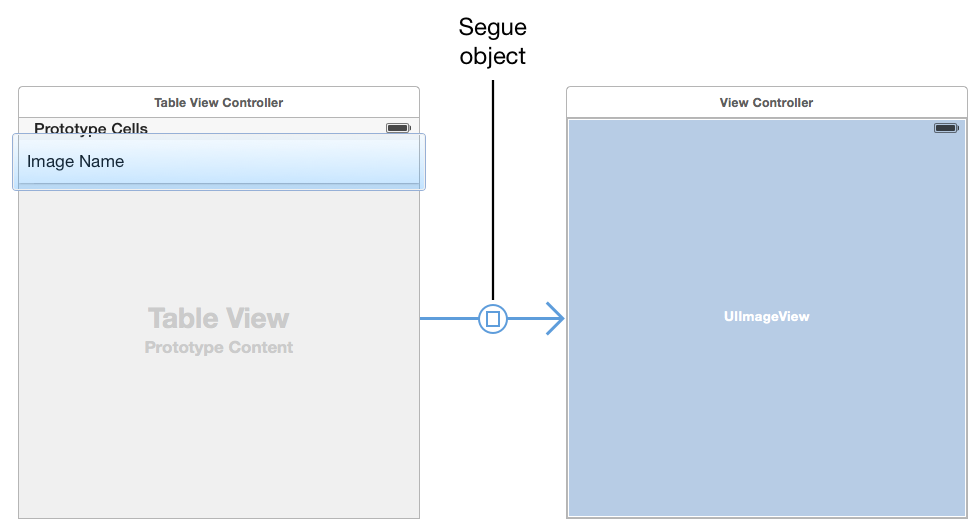
A segue represents the transition from one scene
to the next scene
Segue Type
| Show |

|
Push on top of main stack |
|---|---|---|
| Show Detail |
|
Push on top of detail stack |
| Present in Popover |

|
Show in popover view |
| Present Modally |

|
Show on top of current root view |
| Custom |

|
Custom Segue |